
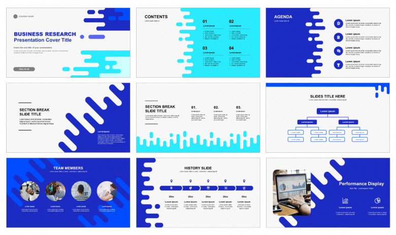
The foundation of any impactful presentation lies in a well-crafted slide template. Whether you're pitching to investors, educating a classroom, or presenting to executives, effective slide design can elevate your message and keep your audience engaged. This article explores the essential design principles that form the backbone of powerful slide templates and how to apply them to make your presentations stand out.
1. Hierarchy: Organizing for Clarity
Visual hierarchy refers to the arrangement and presentation of elements in a way that implies importance. Slide templates should be designed so that the audience can instantly understand what to focus on first, second, and third.
This is typically achieved through variations in:
-
Font size (titles are larger than body text)
-
Color (important elements in bolder colors)
-
Position (central or top-left placement for key information)
A strong template creates a repeatable hierarchy so presenters don’t have to guess how to structure their content. This ensures consistency across all slides and prevents confusion, especially during fast-paced or data-heavy presentations.
2. Whitespace: Breathing Room Matters
Whitespace, also known as negative space, is the area between elements. It might seem counterintuitive, but blank space is one of the most powerful tools in slide design.
Effective use of whitespace:
-
Improves readability
-
Helps focus attention on key content
-
Reduces cognitive overload
Crowded slides can overwhelm audiences. A good template design incorporates intentional margins, padding, and spacing to create a clean and open layout that guides the eye naturally from one point to the next.
3. Alignment: The Invisible Grid
Alignment provides order and structure. When everything lines up, slides look polished and easier to digest.
Templates often use an invisible grid system that keeps text, images, and icons consistently aligned. This can include:
-
Left-aligned titles and body content
-
Centered images
-
Even spacing between bullet points and paragraphs
When elements are misaligned, even slightly, it can make a slide feel chaotic. Strong templates ensure that users can drag and drop elements while maintaining structure, thanks to pre-set alignment guides.
4. Consistency: The Glue That Holds Everything Together
Consistency across slides builds trust and enhances understanding. If each slide looks different, audiences spend more time adjusting to the format than absorbing the content.
Elements that should remain consistent include:
-
Typography (font style, size, and color)
-
Layout structure
-
Iconography
-
Color palette
-
Use of transitions and animations
A powerful slide template includes a defined style guide, enabling presenters to follow consistent design rules without reinventing the wheel for each new presentation.
5. Typography: Readability Over Fancy Fonts
Typography plays a critical role in how your message is received. Overly ornate or hard-to-read fonts can distract or frustrate the audience.
Designing an effective slide template means choosing:
-
A clean, legible typeface (sans-serif fonts like Helvetica, Calibri, or Roboto)
-
Proper font hierarchy (headline vs. subheadline vs. body)
-
Adequate line spacing and letter spacing
The goal is to make sure that every word on the screen is readable at a distance — whether in a conference hall or on a Zoom screen.
6. Color Theory: More Than Just Aesthetic
Color isn’t just about aesthetics — it has the power to influence mood, highlight importance, and enhance readability. Slide templates that use color theory effectively help presenters convey their message more powerfully.
Some tips:
-
Use contrast for legibility (light text on dark backgrounds or vice versa)
-
Employ accent colors to highlight key points or data
-
Stick to a cohesive color palette (usually 3–5 colors)
Color should guide the viewer's eye, not confuse or overwhelm. Powerful slide templates integrate color schemes that balance energy and professionalism, often aligned with brand identity.
7. Imagery: Purposeful, Not Decorative
Images are a core part of visual storytelling — but not all images are created equal. A strong template encourages the use of relevant, high-quality images that reinforce the message.
Best practices for image use:
-
Avoid generic stock photos
-
Use imagery that complements or illustrates content
-
Maintain consistent styling (e.g., all images have the same filter or aspect ratio)
-
Ensure images don’t clash with text (by adding overlays or using text boxes)
Templates that include pre-set image placeholders with ideal aspect ratios can help users maintain visual consistency throughout.
8. Data Visualization: Making the Complex Simple
Charts, graphs, and infographics are essential for presenting data — but without careful design, they can become confusing. Powerful templates offer pre-designed data visualization components that simplify complex information.
Good data visualization design principles include:
-
Minimal clutter (no unnecessary gridlines or labels)
-
Consistent color schemes for charts
-
Clear labeling of axes and legends
-
Emphasis on key takeaways, not every single data point
Templates should guide users to present data in a clean and compelling way, turning numbers into narratives.
9. Modularity: Slide-as-a-Block System
Modern slide templates often embrace a modular approach — each slide is treated like a building block that fits into a larger story. These modules can be:
-
Title slides
-
Agenda or section divider slides
-
Content slides (text + image, bullet lists, quotes)
-
Data slides (charts, tables, timelines)
Designing modular slide templates ensures reusability and flexibility. Users can mix and match slides depending on the content, all while maintaining visual consistency.
10. Accessibility: Designing for Everyone
Accessibility in slide templates is not just a nice-to-have — it’s a necessity. This means making sure your slides can be understood by everyone, including those with visual impairments or cognitive challenges.
Accessibility-conscious design includes:
-
Adequate contrast between text and background
-
Descriptive alt-text for images
-
Avoidance of color as the sole means of emphasis
-
Clear, concise text with readable font sizes
Templates that incorporate these features ensure broader reach and greater impact.
11. Simplicity: Less is Always More
One of the most important principles in template design is simplicity. Great templates are built with the understanding that each slide should convey one clear idea.
Overuse of animations, too much text, or flashy transitions can distract from the message. A simple, minimalist design:
-
Reinforces professionalism
-
Supports the speaker without stealing attention
-
Encourages storytelling through speech, not just visuals
Designing slide templates that embrace simplicity leads to presentations that are both elegant and effective.
12. Adaptability: Built for Real-World Use
Finally, the best templates are built with the end-user in mind. A powerful slide template isn't just beautiful in theory — it must be adaptable in practice.
This means:
-
Easy-to-edit placeholders
-
Pre-formatted slide layouts for common content types
-
Compatibility with different devices and screen ratios
-
Scalable design that works for 5 or 50 slides
Whether it's for corporate reports, startup pitches, or classroom lessons, the template should support flexibility without compromising design integrity.
The Role of Templates in PowerPoint Success
PowerPoint Templates are not just cosmetic assets — they are strategic tools. When designed with the above principles in mind, they allow presenters to focus on their message rather than the mechanics of slide design. From visual hierarchy to modular layout, every design choice in a well-built template contributes to clarity, engagement, and persuasion.
In today’s fast-paced communication landscape, presentation visuals often become the face of your ideas. A well-designed slide template ensures that face is memorable, impactful, and professional.
Ultimately, powerful slide templates empower anyone — regardless of design expertise — to create presentations that resonate. By anchoring your template in strong design fundamentals, you set the stage for your content to shine.
Comments
0 comment